Asking & Answers
Generate Charts
NQRust Analytics builds charts automatically and lets you adjust, regenerate, and export them.
NQRust Analytics produces charts automatically to help you visualize results and spot patterns in your data.
Automatic chart generation
When you ask a question, NQRust Analytics inspects the result and selects the chart type that fits it best. Open the Chart tab on the answer to view it.
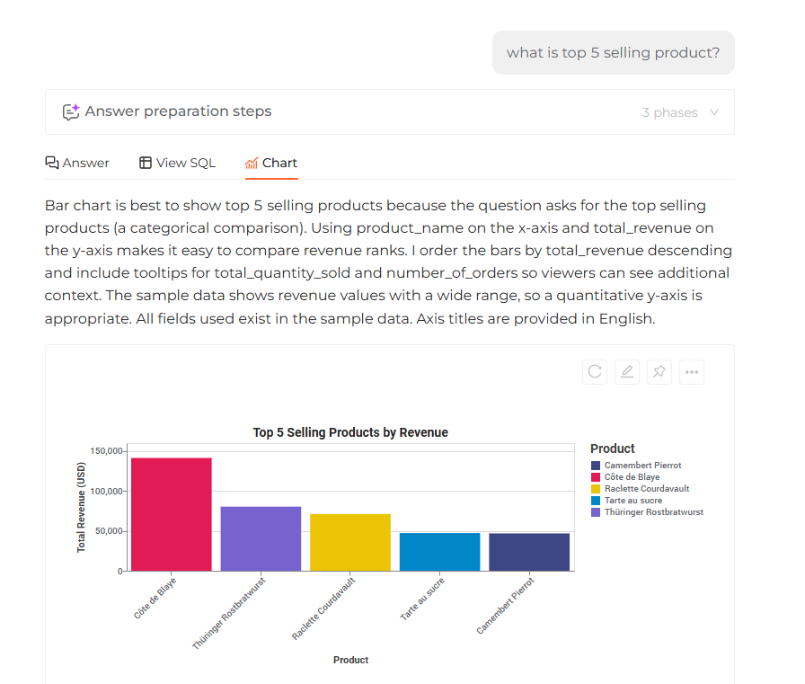 The Chart tab showing a chart automatically generated from the query result
Supported chart types
- Bar chart — compare quantities across different categories.
- Group bar chart — compare sub-categories within a main category.
- Stacked bar chart — show how categories are composed.
- Line chart — track a trend over time.
- Multi-line chart — compare several trends over time.
- Area chart — like a line chart, but with filled areas to emphasize volume.
- Pie chart — show proportions of a whole.
Adjusting the chart
Click the Edit icon to change how a chart is rendered. The fields you can set depend on the chart type:
- Bar chart —
X-axis(categories) andY-axis(values). - Group bar chart —
X-axis(main categories),Y-axis(values), andxoffset(sub-categories). - Stacked bar chart —
X-axis(categories),Y-axis(values), andColor(stack groups). - Line chart —
X-axis(time series),Y-axis(values), andColor(line groups). - Area chart —
X-axis(time series) andY-axis(volume emphasis). - Pie chart —
Theta(values) andColor(categories).
Regenerating the chart
If you are not satisfied with your adjustments, click the Regenerate icon to have the AI build a new chart.
Saving the chart
Click the More icon to export a chart. NQRust Analytics supports downloading in PNG and SVG formats.